An Internet of things

Musings on iOS and PHP development, IOT and other bits and pieces

Seoul City Metro has been finished, sent for approval!

Wow, what a month!

It really was about 10 times more stressful than I had planned.

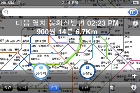
Here I was plodding along with the development of Seoul City Metro (@soulmetroapp) thinking I had another couple of months but all of a sudden the iPhone was approved for sale and then released in South Korea in the same two week period! I had to push everything forward…

So over the last couple of weeks I have more or less shut myself off from everyone except my twitter feed and a few friends keen to test some development releases (thanks to @jacobch for some great feedback). Due to the announcement of imminent iPhone release in South Korea I just had to try and get everything running ASAP.

Unfortunately Seoul City Metro missed being ready for sale on iPhone launch day but as a consolation I managed to make it to TEDxSeoul at the last minute for a day of eye opening talks from a wide range of awesome Korean innovators. I had no expectations for TEDxSeoul (how did I not know about TED ?) but it left me with a mind spinning with excitement and positiveness about releasing software in South Korea. I wish I had had some business cards to hand around and some information on the app ready - but getting to go was just a bonus.

Seoul City Metro

But I’m now happy to write that I have finally got there! As of Tuesday morning I have completed an initial working version of an iPhone app and submitted it to the App Store. With submission only four days after the release date in South Korea I am pretty happy with my efforts. This is is a really important milestone because it’s taken me so long to get past being completely overwhelmed by the whole process of becoming an iPhone developer. In fact it’s taken me two trips to WWDC, two iPhone releases (3G & 3GS), two new computers (a laptop and a Mac Mini) and countless days and weeks of feeling overwhelmed and lost at where to start.

JCMultimedia Business Cards

Regardless of the outcome I’m feeling like I have reached my goal. While I wait for approval from Apple I’m running at a slightly slower 80 km/h getting promotional material ready for it’s launch. I’m hoping with some relevant, informative tweeting on my behalf via I can rustle up some interest over Twitter and Facebook, there’s also a website up at seoulmetroapp.com and I have printed flyers and business cards for some real life promotions.

I’m attending the Seoul Writer’s Workshop Masquerade Ball this Saturday night in Itaewon and hope to bump into some people there.

Watch this space for all kinds of things I’ve learnt over the iPhone development process, and updates on what I’m calling the City Metro Ecosystem - a suite of apps encapsulating apps for Hong Kong, Beijing and Shanghai.

City Metro Apps Ecosystem

A lot of transport apps are confusing and inconsistent

There’s no shortage of apps that will let you sift through lists of stations or tap on a map and work out a way for you to get from A to B in your given city.

I’ve been working with a pile of transport apps while developing Seoul City Metro and I’ve noticed a lot of apps fall into the trap of implementing too many non standard UI elements or offer too many different ways to do the same thing at the cost of consistency.

Non standard UI elements are quite common. A lot of developers decide not to adhere to the apple Human Interface Guidelines and instead create their own half baked UI elements. I have found some great examples of non-scalable, non standard implementations that are so bland and basic (or inversely crazy and complex) that it’s hard to know what you’re doing or what you just did. The time required to lean these UIs can be quite frustrating.

Great example of very non-standard UI

Another issue with the current state of transport apps is the compromise made to consistency in order to offer multiple ways of accessing the same functionality.

Most transport apps provide you with a list of stations you can select via searching or scrolling through via a ‘Stations’ Tab Bar icon. This interface is then repeated via a ‘Routes’ Tab bar icon and quite often you can also access the ‘Stations’ via the ‘Lines’ Tab Bar icon. My problem with this solution is when the selection of a station name in a list looks the same and behaves differently.

London Tube App

As is often the case, selecting a station from the ‘Stations’ tab gives you a detailed overview of the station. In the case of the ‘Route’ tab it skips the details and provides you with the same interface over again to select another station.

A lot of apps have about 3 ways you can enter into the ‘route calculation loop’ and I find this overlap pointless and confusing.

Another example is when applications let you tap on a map and use the selection as a ‘route start’ or ‘route end’ and then take you to a list or an overlay of the route you’ve selected. This can be a great feature except when you can get to the same map that behaves differently via three other Tab Bar icons.

In the case of applications with a tab bar interface you can end up with the same screen of information appearing on all or most of the tabs at once by navigating through each Tab Bar icon independently. This is not a good user experience because clicking on a tab bar icon saying ‘Stations’ can be showing a map if thats how the user haphazardly left it.

My approach to a transport app focuses on the soul purpose of directing the user towards selecting stations. The user will be given ways to select a station by map, name, or nearby then be presented with the detailed view of the station in order to decide what to do with it. After the user has completed an action their selected station (set as route start, or route end), the user navigates back to the main menu to select a second station. Only when a route has been completed are they presented with a ‘view route’ option.

Straight forward navigation structure

So rather than a Tab Bar I have used a single navigation structure to direct the user down a single path at a time to select a station. This provides the user with a linear way of working, keeping them from getting confused between 5 or more tabs that all do similar, overlapping things (and could all be displaying a map at that particular point in time).

I think it saves the user mental processing too. The maximum menu depth a user can get to to view a calculated route is only three screens deep, and if they have used a route before they can get to the calculated route in only two steps. The worst case in the application above (London Tube) can require you to navigate through 5 different screens to view a route and then you need to go back through the whole 5 to start again.

I think simplifying transport apps is the way to go, working and thinking about how to do this all the time.

Seoul City Metro should be hitting the App Store around December 14th, 2011.